The Decision Every SaaS Founder Faces
What Actually Makes a B2B SaaS Website Convert

Zubair Ali Akbar
Most B2B SaaS websites have the same problems. Generic hero copy. Feature focused pages. Buried pricing. Cluttered navigation. Weak CTAs.
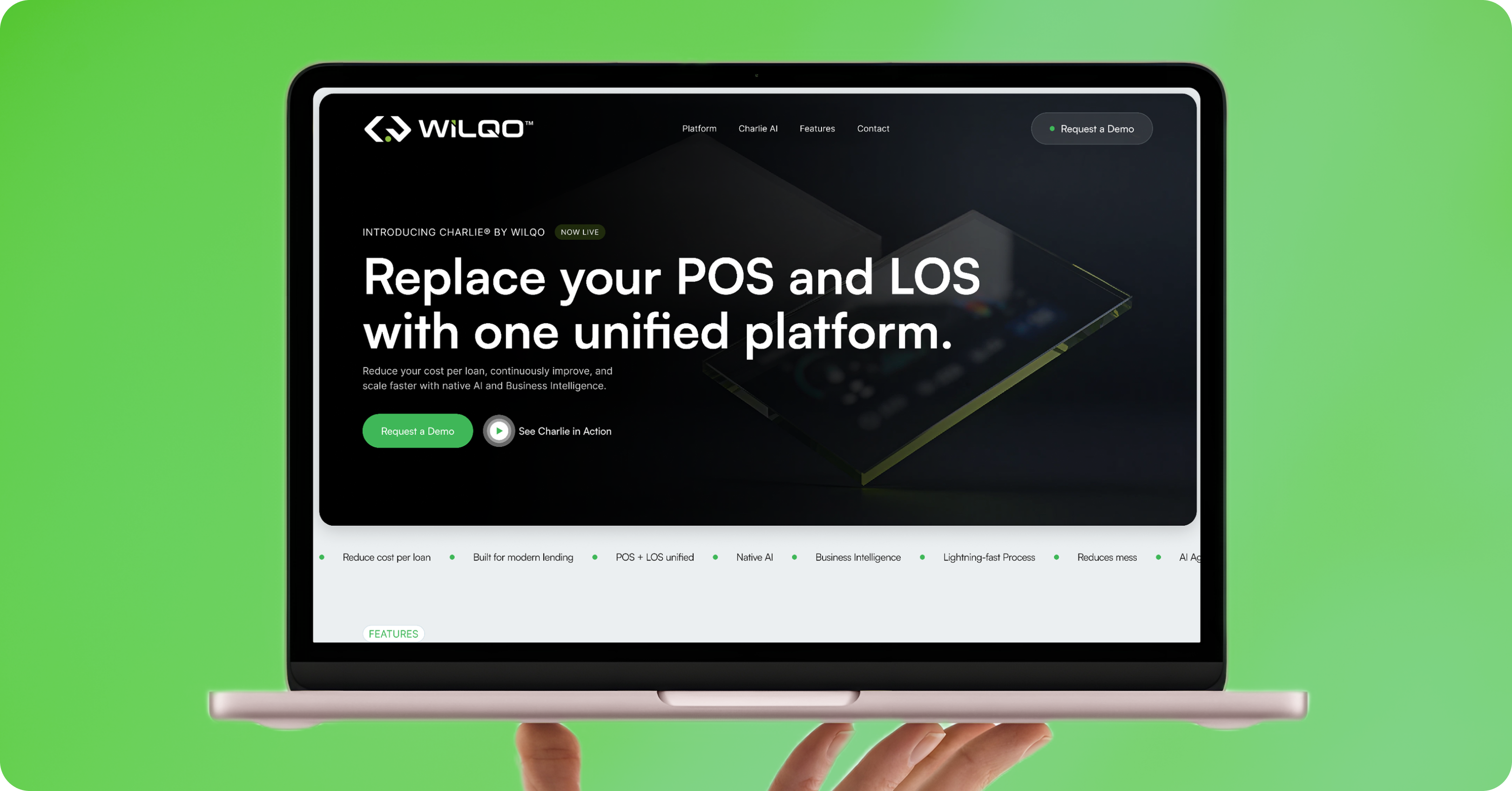
Fixing them isn’t complicated. It’s just uncomfortable, because most fixes require choosing what matters and cutting the rest.
Here’s what actually drives conversion on B2B SaaS websites in 2026, based on patterns across the 500+ sites we’ve shipped.
Element 1: A hero that answers three questions in 5 seconds
Every B2B SaaS site visitor asks three questions in their first 5 seconds:
- What is this product?
- Who is it for?
- Why should I care?
Your hero has to answer all three. Not vaguely. Specifically.
Weak hero: “The future of team collaboration.”
Strong hero: “Ship 40% faster with the async product docs tool built for distributed engineering teams.”
Notice the difference:
- What it is: an async product docs tool
- Who it’s for: distributed engineering teams
- Why care: 40% faster shipping
Every hero should pass this test. Most fail it.
Element 2: Named social proof above the fold
“Trusted by leading companies” with a row of anonymous logos doesn’t convert. Named social proof with specific brands does.
If your customer list includes recognizable companies, name them. If it doesn’t, name the ones your visitors will recognize by industry.
The strongest hero social proof pattern in 2026:
- Named companies (3 to 5 logos maximum)
- Specific credibility line (“4.9 stars from 200 reviews”)
- Optional but powerful: a single customer quote with a name and title
Element 3: A single primary CTA
Every B2B SaaS site has too many CTAs. Book a demo, start a trial, contact sales, download the whitepaper, subscribe to newsletter, watch the video, follow on LinkedIn.
Pick one primary CTA per page. Make it visible in the hero and repeated after every major section.
Secondary CTAs can exist, but they should be visually subordinate. A single yellow button with black text has more conversion power than 5 similar buttons.
Element 4: Feature sections that lead with outcomes
Weak feature section: “Real-time sync across devices. Ensures your team always has access to the latest version.”
Strong feature section: “Never lose an edit in a comment thread again. Real-time sync across devices.”
The pattern: lead with the pain your buyer feels, then explain the feature that solves it. Not the reverse.
This one change usually adds 15 to 25% to feature section engagement.
Element 5: Pricing visible without a form
The single biggest B2B SaaS conversion killer: hiding pricing behind “Contact Sales.”
If your pricing genuinely requires a conversation, show ranges. “Plans start at $X. Enterprise plans start at $Y.” Give buyers enough to know whether you’re in their budget before they invest time in a call.
Buyers hate surprise pricing. Every founder who thinks they’re protecting the sales process by hiding pricing is actually shrinking their qualified pipeline.
Element 6: A pricing page that helps buyers pick
Most pricing pages just show plans. Better pricing pages help visitors self-select.
Add one sentence above the plans: “Most teams under 20 people start with Pro. Most teams over 50 need Business.”
That single sentence removes decision fatigue and moves buyers toward the plan that fits, faster.
Element 7: Fewer, better case studies
Every B2B SaaS site has case studies. Most are forgettable.
The pattern that works:
- Specific client name (not “a leading fintech company”)
- Specific problem (not “wanted to grow”)
- Specific outcome with numbers (not “significant improvement”)
- One quotable line from the customer
Better to have 3 memorable case studies than 15 forgettable ones. Cut ruthlessly.
Element 8: A demo booking flow that’s actually easy
Most demo booking flows require: name, work email, company, role, phone, company size, use case, timeline, and how you heard about them.
By the time buyers fill out that form, they’ve reconsidered whether they wanted the demo.
The demo booking pattern that works in 2026: work email, first name, one question about their use case. Everything else goes into the discovery call.
Every field you remove increases conversion. Test aggressively.
Element 9: Objection handling that isn’t buried in an FAQ
Every B2B SaaS buyer has objections. Security, integration, migration, pricing, contract terms.
Most sites put objection handling in FAQ sections at the bottom of pricing pages. That’s the least-visited section of your site.
Better: address the top 2 to 3 objections inline where they arise. Security concerns near the trust logos. Integration concerns near the feature list. Contract concerns near the pricing.
Buyers who resolve their objections stay on the page. Buyers who don’t leave.
Element 10: A footer that respects the visitor
Weak footers: sitemaps, dozens of category links, social icons, newsletter signup, and a wall of legal text.
Strong footers: contact information, main navigation, one relevant lead capture, and required legal.
Most visitors don’t scroll to the footer. The ones who do are looking for specific things. Make those things easy to find.
Elements that don’t matter as much as you think
Complex animations. Subtle motion helps. Elaborate animations distract from the message and slow load times.
Perfect stock photography. Better to have no photography than mediocre stock photography. Better still: real photos of your team, product, or customers.
Chatbots on every page. Chatbots that answer specific product questions help. Generic “Hi, how can I help?” bots hurt more than they help.
Video hero backgrounds. Almost never worth the load time cost. Static images with a subtle video-in-frame perform better and load faster.
Live counters and social proof widgets. “27 people are viewing this right now” reads as manipulation to sophisticated B2B buyers.
The uncomfortable truth
Most B2B SaaS websites don’t convert because they try to do too much for too many people. They hedge everywhere. They have soft answers to every question because they’re afraid of losing the visitors who need different answers.
Sites that convert are opinionated. They pick a specific buyer, address that buyer clearly, and let non-fit visitors leave.
You lose fewer buyers than you think when you get sharp. You gain far more of the right buyers than you expect.
If your B2B SaaS site isn’t converting like you want, we can audit it and give you a specific set of fixes to test. Book a 30 minute call.