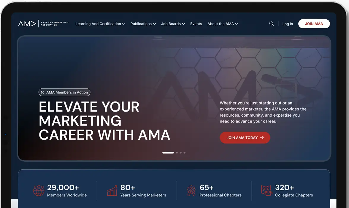
This initiative involved the complete transformation of the American Medical Association Foundation's digital presence through the strategic design and implementation of an integrated HubSpot platform.
AMA Hubspot focused on replacing a outdated, static website with a dynamic, all-in-one ecosystem designed to streamline donor engagement, amplify program awareness, and support the foundation’s vital mission in public health. The publishing, and program applications—into a centralized, user-friendly system.
Project Name
AMA Hubspot
Industry
Marketing & Technology
Designing for Trust & Impact
Our design strategy focused on creating a digital experience that reflects the AMA Foundation's credibility and compassion. We evolved the visual language with a refreshed, professional color palette, clear typography, and impactful imagery of real people and communities served. The user-centric layout prioritizes intuitive navigation and clear calls-to-action—guiding donors to give, grantees to apply, and advocates to learn with ease.
The Problem
1
Disconnected User Experience
Donors and applicants were sent to confusing, external systems.
2
Passive Website
The site was a static brochure that failed to capture leads.
3
Manual Processes
Staff spent hours on repetitive tasks like data entry and acknowledgments.
4
No Clear ROI
Inability to track what was working and prove impact.
The Problem
1
An All-in-One Hub
A single, integrated HubSpot platform for a seamless, branded journey.
2
Conversion-Focused Design
Strategic forms and CTAs built in HubSpot to grow your contact database.
4
Data-Driven Decisions
Custom dashboards to measure performance and optimize strategy.
3
Smart Automation
HubSpot workflows to auto-process donations, applications, and communications.
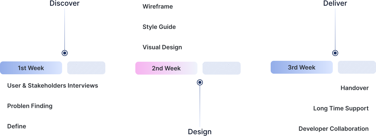
Design Process
& Timeline
We followed a structured approach to ensure a strategic and efficient transition to the new HubSpot platform. This process balanced deep discovery with agile execution, keeping the project on track.
Competitive Analysis
Features
AMA Foundation
American Cancer Society
AHA Foundation
Variety of Booth Types
Instant Photo Prints
Digital Sharing & GIFs
Easy Online Booking
User Persona
About
Name: Dr. Anya Sharma Age: 34 Occupation: Practicing Physician Location: Chicago, IL Tech Proficiency: High, But Poor
Goals
Donate efficiently to a credible cause.
Understand the tangible impact of her contribution.
Find reputable grant opportunities for her clinic.
Pain Points:
Cumbersome, multi-step donation processes.
Unable to easily track where funds are allocated.
Difficulty finding specific programs.
Needs:
A streamlined, two-minute max donation path.
Clear, immediate confirmation of impact.
A perfectly organized and intuitive website.
Technology:
Google reviews
Social media
AI Platforms
Online portals
Motivation & Limits:
Motivation
Time
Budget
Experience
Empathy map
Thinks
Is this foundation reputable and well-managed?
Will my donation actually make a difference?
I hope this doesn’t become another spammy mailing list.
Says
“I want to know exactly where my money is going.”
“Is this site secure for my personal information?”
“I don’t have time to click through 5 pages to donate.”
Does
Researches organizations online before engaging.
Abandons lengthy or confusing forms.
Prefers quick, seamless transactions on mobile.
Feels
Frustrated by inefficient or unclear websites.
Hesitant to trust organizations without transparency.
Motivated to help but pressed for time.
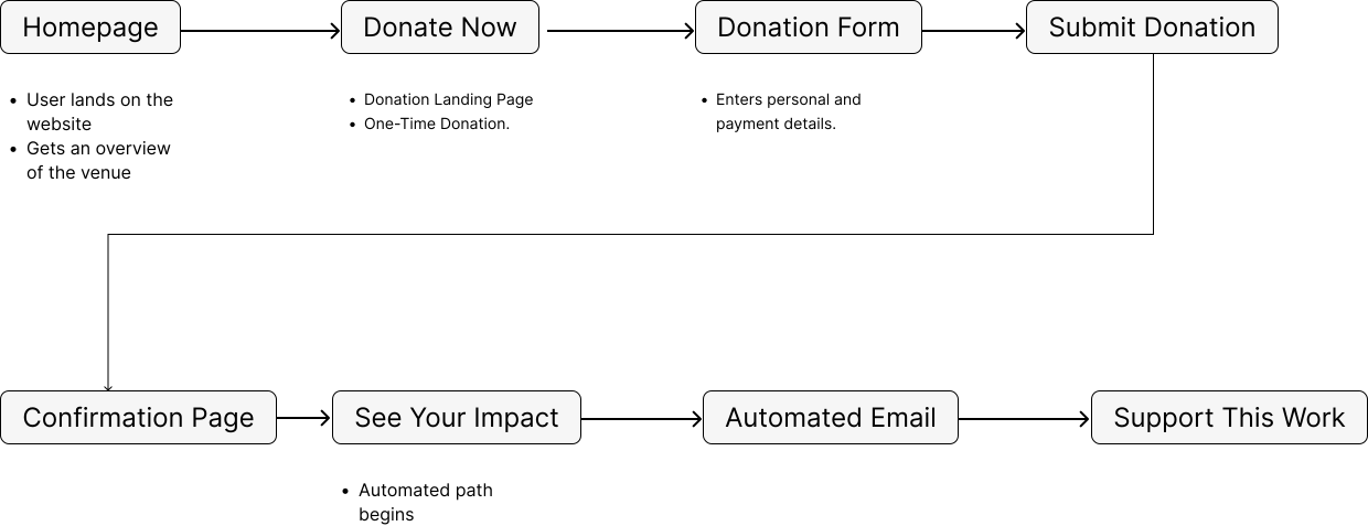
User Flow
Typography & Color
AMA uses clean, readable fonts and a soft, calming color palette to create a positive and stress-free reading experience.